

Submit & Skip
Problem
Submit & Skip, a feature that allowed customers to skip the manual entry of their prescription by uploading a photo of their Rx, was being underused on a crucial page of the purchase funnel.
Solution
Create a pause in the purchase flow to properly educate and encourage customers to use the Submit & Skip option.
Timeframe
Aug 2016
Dropping Out of the Purchase Funnel
Looking at the end-to-end experience of purchasing contacts, we learned that the Product Page was where customers were significantly dropping out of the purchase funnel. The Product Page included images of the contacts box, a product description, and the form below asking for the customer’s prescription information. Submit & Skip was a newly added feature that allowed customers to upload a photo of their RX instead of manually entering it. As you can see below, it was an either/or option:

A Clue
After looking at our analytics and heat maps, we learned that some customers were uploading an image of their Rx and entering it manually. Why were customers doing more work than they needed to?
Possible Reasons
Customers might think they have to both upload an image and enter their Rx manually. They might not realize it’s an either/or option.
Keeping customers on the page after they’ve uploaded their image (instead of automatically moving them through the flow) might make them think the manual entry is also needed.
The form fields might be demanding more visual attention, causing customers to overlook the image option and only notice if after they’ve filled out the form.
With a tiny “or” smooshed in between, it might not be very clear that uploading an image of your Rx allows you to skip the manual entry.

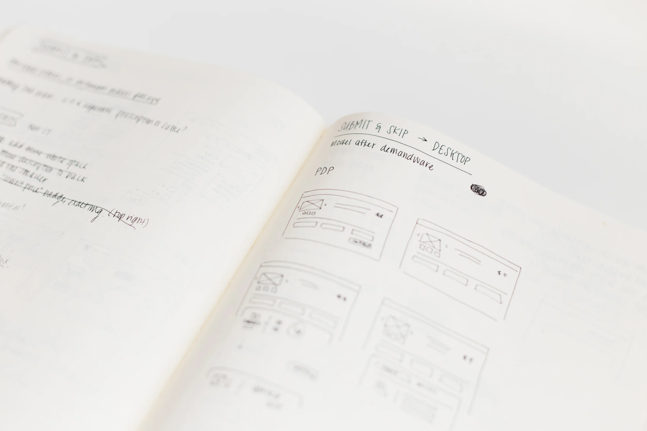
Sketching it Out
One of my first instincts was to provide more education around Submit & Skip. We had already seen so much success with the feature that we truly believed we’d have less manual entries if we could get users to understand how it works. Secondly, I thought that separating the Rx portion from the product page would be beneficial because of how busy the page already was. I wanted to fully have the user’s attention by the time they were presented with the Submit & Skip option so that they could take advantage of this time-consuming feature (for both the users and the business).
Solution
Part 1: Separate the Rx from the Product Page
After a couple of iterations with the team, we decided to remove the Rx portion from the product page and introduce it after the user has added the product to their cart. This way, the user can focus solely on their Rx once they’ve made the decision to proceed with their selection.
Part 2: Give Submit & Skip its own page
Submit & Skip was given its own page in the purchase flow which forces users to pause, learn about Submit & Skip, and then select how they wanted to enter their Rx.
Part 3: Communicate value propositions via content and illustrations
To further encourage the use of this feature, I highlighted the fact that the verification and shipping process is sped up and created simple illustrations to accompany text on the page.
Part 4: Made manual entry a deliberate choice
To encourage the image upload and discourage the manual entry, I made “Upload Photo of Rx” the primary CTA and made “Enter Rx Manually” the secondary CTA with the use of colors. This, I hoped, would ensure that our users would only enter their Rx manually if they deliberately wanted to (instead of unknowingly doing extra work as they might’ve before.)

Submit & Skip Prototype on Desktop
Extras
Below are some commercials that were created for 1-800 Contacts which highlight the Submit & Skip feature. Enjoy! (Moses is my personal favorite)
