
1-800 Contacts App Redesign
Problem
The 1-800 Contacts app successfully streamlined the contacts-ordering process but lacked a thoughtful, user-friendly design.
Solution
Collaborate with the app development team to redesign the entire app experience and improve the end-to-end flow.
Timeframe
Nov 2014 - Aug 2015


Old Flow
Observations:
– App felt busy and hard to scan at times
– Research previously done showed that customers more quickly found their box by viewing a picture of their box instead of the actual name–and images felt really small.
Possible Solutions:
– Improve layout and readability by using more white space and use a grid to ensure elements line up nicely.
– Show bigger images of products.


Process
I started out by sketching out ideas and possible solutions. Each week I would present my designs to our team which consisted of myself, art directors and lead developers. Each chunk of flow in the app would go through about 2-3 iterations.

Final Designs

Home Page
All previous distractions were removed from the home page so that the user is focused on selecting one of the two options.

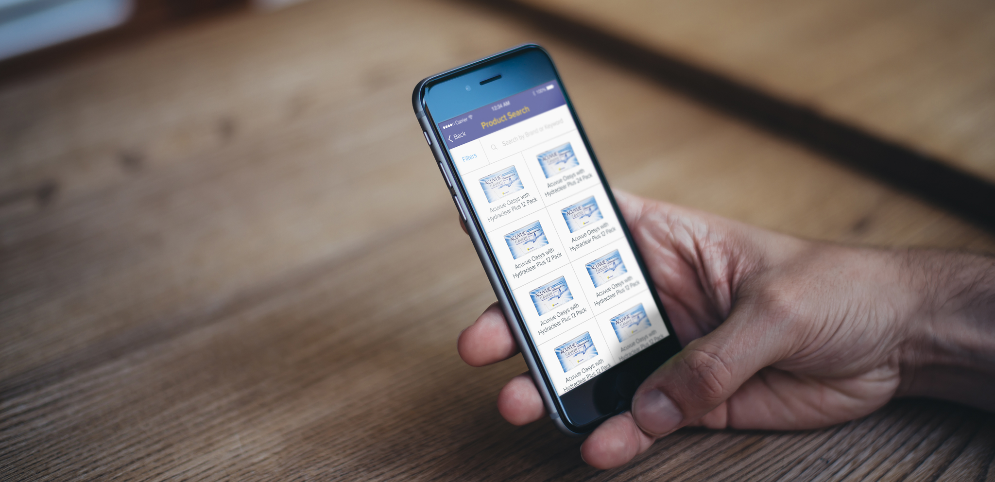
Product List
In order to help our users find their box faster, the ability to use a filter was added and product images were made bigger.

Rx Page
Dropdown menus for prescription values were made bigger and spaced out so that this page didn't feel so crowded. The screen was also split down the middle so that you can focus on each eye at a time and see the values side by side.

Quantity Selection
In addition to allowing users to select how many boxes they wanted to order, supply-specific quantities were added so that users had a clear understanding of how long their lenses would last them.

Eye Clinic Search
Layout for this page was improved by spacing out elements more so that results were easier to scan. Each doctor/eye clinic information was broken down into 3 lines so that all of their information would be visible at first glance.

Cart
Another busy page, the cart was given a lot more white space so that it didn't feel so heavy. Instead of just listing the products, I organized them by person so that a user with contacts for multiple people could easily see who they were getting contacts for.

Apple Pay
Apple Pay was added for iOS users and Google Wallet was added for Android users.

Checkout
If Apple Pay/Google Wallet wasn't available or used by the user, then other options were provided like scanning your card or paying with Paypal.

Credit Card
When manually entering a card for payment, I took advantage of a feature that would automatically move the user through the form fields instead of having them tap into the next form field. (i.e. when the app recognized that 16 digits were entered for the card number, it automatically moved them to the expiration date field). An image of the user's type of card is also shown after the first 4 digits are entered.

Shipping
Asking for the user's zip code before state or city takes advantage of a feature that is able to automatically populate the city and state based on the zip code. This allows the user to skip 2 form fields, thus moving them through the flow much faster.

Confirmation
The Thank You page was divided up so that the content would be easier to consume. I also added the "What about my rebate?" section so that users wouldn't be left in the dark as to what to do concerning their rebate.
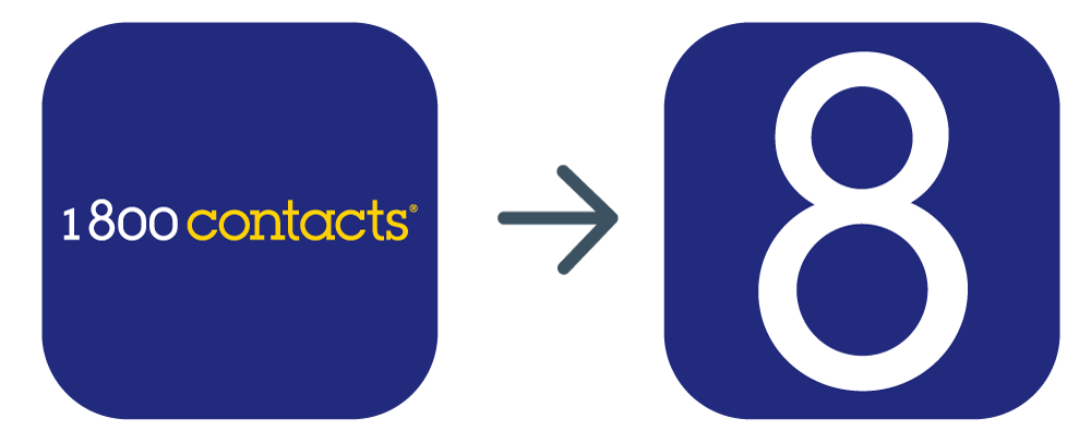
App Icon
The old app logo tried to fit the entire 1-800 Contacts logo into the square but it was getting lost in the midst of all surrounding apps once on the screen. The logo was simplified to just the "8" in the 1-800 Contacts logo which also resembles a contact lens case.
Takeaways
Involve developers early on. Prior to my arrival, the app belonged entirely to the app development team and they later revealed how hesitant they were to allow me to redesign the entire experience. We involved the app dev team from the very beginning and it taught me how important it was to make them a part of the design process. They were there every step of the way providing a unique and immensely valuable perspective. I also believe it gave them a continued sense of ownership so that by the time it was ready for handoff, they were excited to build something they had helped design.
When in doubt, A/B test! Our team prided itself in being data-driven and making design decisions backed by data whenever possible. When we couldn’t decide on a direction and it made sense to, we’d put two designs to the test and let the results decide.
Decide who has the final say. With a team as large as ours, it was challenging to navigate so many different and valid opinions. While we A/B tested as much as we could, sometimes a decision boiled down to a matter of opinion. In those instances, it was helpful and important to know who had the final say. When it came to designing, I had the final say and was grateful that my team respected that. When it came to the business, the final say was given to the VP of Digital Commerce.