Eye Clinic Search
The 1-800 Contacts app provides a fast and easy way for customers to order their contacts. For those who choose to manually enter their Rx (prescription), they must also provide their eye doctor's information because 1-800 Contacts is required by law to verify the customer's Rx with their eye doctor. The app provides a way for customers to search for their eye doctor but we found that the doctor search page wasn't super successful and some users were falling out. I was brought on as the lead UX designer for this project and collaborated with app developers, the app project manager, director of digital commerce, and VP of digital commerce to address the issues.
Launched
Jan 2017
My Role
Lead UX Designer
Understanding the problem
Observations
– Users were often hitting the back button when brought to the doctor search page
– Users were spending a considerably long amount of time to move on from the page
– Some users were quitting the app all together when they were on the doctor search page
Possible Problems
– The flow can be a bit jarring for new users since they are dropped into the very busy search page without any kind of warning or clear explanation for what they are to do next.
– Confusion around why their doctor information is needed
– Maybe users are more likely to know the name of the Eye Clinic instead of the name of the Eye Doctor
– Maybe the name of their Eye Doctor is not in our database and the user was unable to find him/her
– With so much going on in the page, the user can very easily overlook the option to skip this part by uploading a picture of their Rx (top of page)
PROCESS
We started out by holding a discovery meeting in which we mapped out the goals for the project and discussed possible solutions to the present issues. I sketched out ideas and possible designs which I presented every week to our team. I focused on trying to make this experience more of a hand-holding experience–especially for new users. I tried to break down the steps as much as possible without adding too many unnecessary pages and provided ways and features to simplify or cut down the time spent in this flow. This project went through 2-3 iterations.
USER TESTING
After a week of sketching, designing, and getting feedback on my designs from our team, I made a prototype of the entire experience and tested it on users.
Results
– Confirmed the belief that a lot of customers are much more likely to remember the name of the Eye Clinic where they got their eye exam instead of the name of their Eye Doctor
– Users loved the "same as before" feature which suggested the user's previous eye clinic if they were a returning customer. This cut down their search time significantly.
– Users found the "explanation page" very helpful and easy to understand. They especially loved having a quick link explaining why this information was being asked
– Users were easily able to add an eye clinic that was not in our database
PROTOTYPE
This is the prototype I created for our users using Adobe XD. Feel free to play around with it, but keep in mind that since it is a prototype, there are some missing functionalities such as the keyboard and actual search function.
Final Designs
Explanation Page
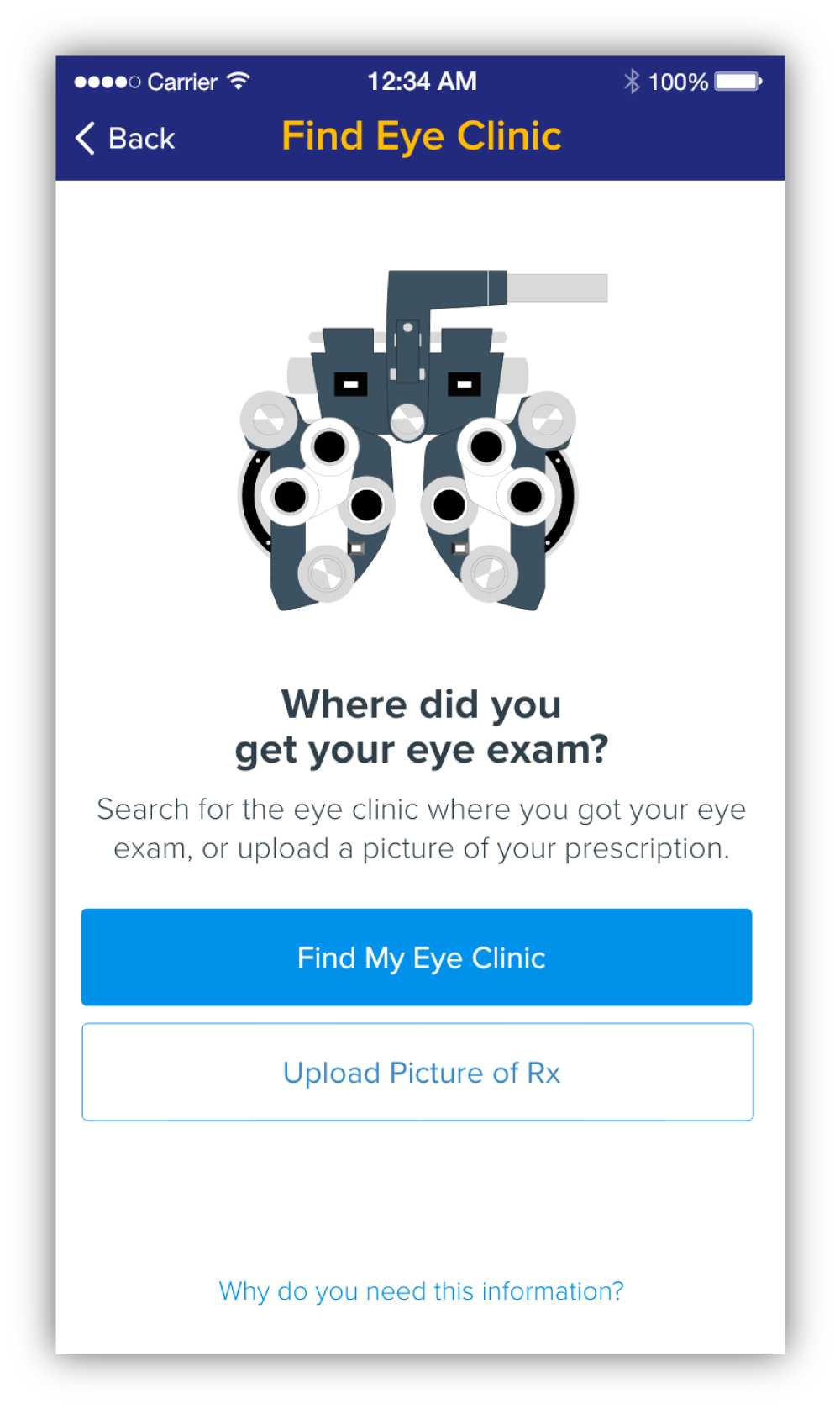
I added this page so that users are given time to understand what the next step is as well as give them the option of how to proceed instead of just dropping them straight into a search. Having the user click "Find My Eye Clinic" will set the right expectation for the next screen and it won't be a surprise for the user. I also provided a way for users to skip this step by uploading a picture of their Rx. And for those who don't understand why we need their eye clinic information, I provided a link that provides that explanation (next screen).
Eye Clinic Info Modal
This modal explains why we need their eye clinic information and also points out that it takes time for us to verify their Rx. Again, I provide a way for users to skip this step by uploading a picture of their Rx.
Search
I isolated the search function from the flow so that users can focus on just the search while using it. I placed it in the blue header to separate it from the suggestions below and make it easier to digest. Current location is used by default. If the user is returning, then we suggest their previous used eye clinic. As the user beings to type, eye clinics near them will be suggested.
Results
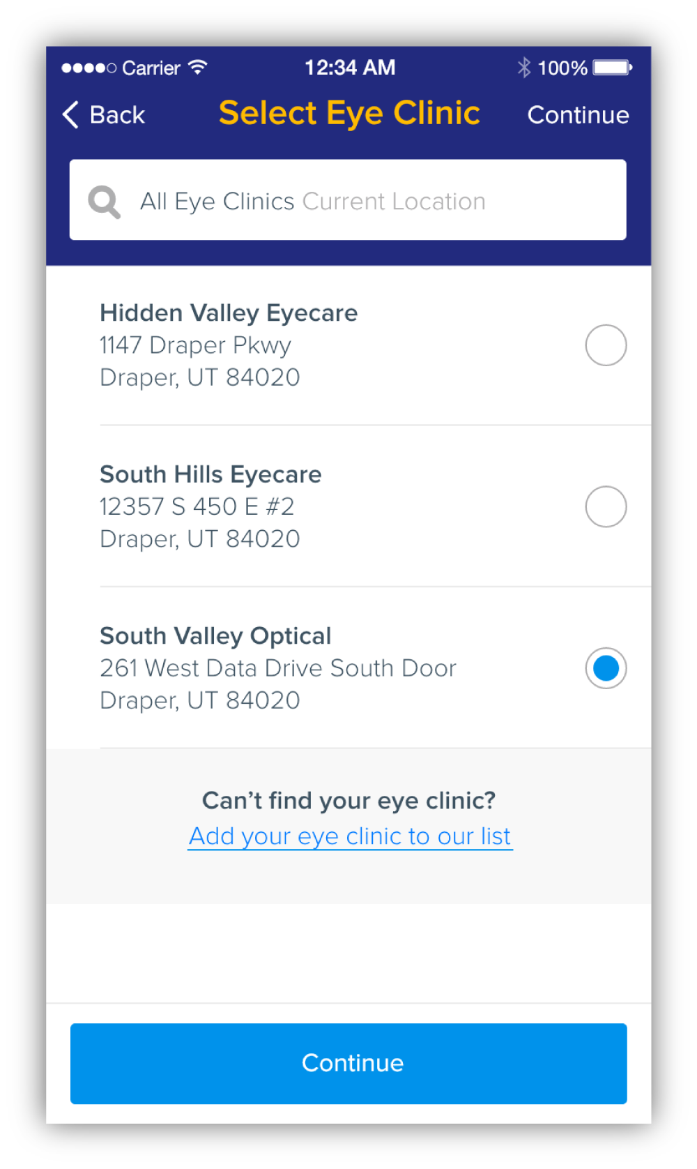
Once on the results page, the two search fields are collapsed into one so that users can focus on the results. For those we are unable to find their eye clinic, we've provided a link to add their eye clinic to our database. The link will appear after every 10th result and at the end of the list.
No Results
I wanted to make sure we were especially taking care of our users during a bad experience such as a "no results" page. I created a friendly and slightly humorous illustration and copy as well as a link to add their eye clinic to our database.
Add Eye Clinic
At this point, the user might be frustrated so I wanted to make the page and form fields as straightforward as possible and only ask for the required information.


